Tag Archives: professional logo design

Indispensability Of A Professional Logo For Any Organization

Professional Logo

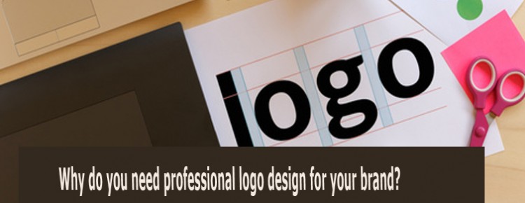
A logo probably is what is your face for you. And let’s face it: we always draw a notion about people depending on his face or appearance. Somewhat same is the case of a logo. Now the point is whether it should be a professional one or not?

Lets put it in this way, you are going to an interview and the job profile suits you best as per your eligibility and knowledge, and you have your resume written on crushed paper. In this case, no matter how strong candidate you are, the company will not even bother to continue with the interview process as the shabby resume will completely ruin your impression towards the related audience. A lot of experience will also be not enough to get selected.

The same situation will arise with your products and services. In spite of providing good quality, the target audience will take no interest in it. People tend to make a quick decision, the first impression for the prospective customers, clients, and suppliers is significant and that justifies how professional you are. The purpose is to built audience trust, and logo being the face of your business conveys that to the viewers.

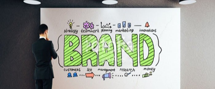
However, a professional logo has many advantages than only creating a good impression. It serves as a reputation tool for your company in the long run. Have a glance at them:

Build the primary trust factor:

A customer before coming to your store or logging to your website, they get an impression about the brand, partially from the logo. If you go for a professional logo design, it’s more likely that the customers will think your business to be so.

Appealing to the new customers:

An efficient logo is versatile, communicating and attractive to the customers and all these required features combine in making the logo memorable. Then the remembering enables them to reach the brand at the required time.

Your logo solidifies consumer loyalty:

A logo is a tool that consistently promotes the company identity even after the brand identity is established. Use of the image in various formats and the repetitive creates its effectiveness. Familiarity or awareness is the key to flourish the business. In the world of business, it’s called consumer loyalty.
Ones you are a known brand, the glimpse of the logo will be good enough for the customer to relate to your brand creating a loyal customer base.

Surpass the competitors:

Just browse through your mobile or desktop you can see hundreds of brands that are unable to make a mark in the mind of the viewers. Making your brand distinct from the contenders is an extra edge that you can do with a unique and professional logo design.

Logo establishes ownership:

A logo is the brand ambassador or the signature of the company. It eliminates the chances of infringement or safeguards against forgeries. If any company ever tries to replicate or reproduce your brand’s logo you can sue the brand in consumer court.

5 Vital Questions To Ask While You Opt For A Professional Logo

Logo

Outstanding logos are recognized even at a single glance and they possess features to be memorable too. Examples like Nike’s swoosh and Apple’s a bite taken apple is eye-catching. Both the brands have the logo designs that are unique and consistently work as a potential logo should: provides innovation, stands out in the crowd, most prominently intrigues customers which leads to sales.

We are all aware of some iconic logos, but we are not aware of how are they created. The complete process of conceptualization to the final point there are various steps to be considered and when you go for a professional service for it, you must ask them about these:

How many types of logos are there?

Generally, there are four types –

Wordmarks – As the name suggests it only with different patterns of words like multi-letter abbreviation logotypes. Some examples can be more explaining Ebay, Google, and IBM

Letterform – These logos include a single letter. Example Honda, Uber, and McDonald’s.

Pictorial Logo – this form of logo generally have illustrated symbols of known things. Examples – Twitter and Starbucks.

Abstract Logo – they actually don’t represent anything otherwise recognizable, just as an abstract art. The best example can be the Logo of Nike.

What is the type of logo that will be best for my company?

The most difficult part is there is no fixed type of logo that will work for every industry type. What will suit completely depends on the name and message you want to convey through it seen through the designer’s eye. For instance, if your company name is a smaller one, a wordmark logo can serve the purpose better, like eBay. The abstract form of the logo makes the name memorable for the customers.

What are the important points of business that my logo should convey?

The logo – its color, design, shape – all should evoke an essence of your brand and convey what your is all about. Wheeler says “When people look at it, they should get a feel for your brand personality and your distinctive point of view.” They should recognize that you are a level up and different from the other contenders.
Amazon’s logo has “a” to “z” with an arrow below which implies a smile and as they provide everything so it’s a to z.

What are the suiting colors?

Color is eminently important. According to the industry experts, it is better not use the same colors as the closest competitors do for their logos. Use different color tones for giving psychological punches. Like red in KFC’s logo signifies hot and spicy food, yellow is happiness, energy and can be used for the health-related companies.

What fonts should I consider?

The fonts are also a significant element in a logo. Selecting a fancy logo can’t serve the purpose but must be easily readable from a distance too. None likes to squint while looking at the logo so the size and shape of the font mater. For example, a law firm which is related honor-ability, justice, and can be described best with bold fonts and for toy company or candy shop playful fonts can be very viewer engaging.

3 Simple Points To Be Considered For Creating Corporate Logo

Corporate Logo

There are many big companies out on the market that is doing very well. When you have a look at their corporate logo design, what are the things that capture your attention?

Simplicity

Most of the major corporations in the world that are very well-known would have a professional logo design. And most of these corporate logos are very simple when you look at the way they have been designed. These huge corporations know that in order to lead the pack, they must have a very good logo design that the general public out there is able to identify and recognize. Let’s take for example Pepsi, the soft drink company. They had their old logo re-designed about 11 times. Talk about keeping your image fresh! Yet any time when people see a Pepsi logo, they would immediately know what their product is. The same goes for a well-known competitor which has also changed and refreshed their company logo but no matter where you go, people will instantly know the giant soft drink maker by just looking at the logo and it’s trademark red color. And mind you, both of these companies have a very simple logo but their marketing has been amazing in promoting their product.

Easy To Read

Another element that is important when it comes to having a professional logo design is that the logo itself must be easy to read by anyone out there. No point having a logo that is not easily readable. Avoid small fonts or complicated fonts as the idea of a corporate logo design is for people to be able to read and identify with your company no matter where they are easy. So it is always important that if people cannot make sense of your logo design, they should still be able to read what your company name is. That is why huge companies like Intel, Dell, and Google keep their design simple and yet promote their company name with their company logo.

Must Project Company Image

And like all these huge corporations like Microsoft and McDonalds, it is important that their company logo projects the right corporate image as well. Color also plays a difference in how a company logo is able to project the setting. For example, some companies could change their company logo color during certain holiday seasons to reflect the time of the year or occasion to mark some significance. During St. Patrick’s Day, for example, some companies could change their logo color to green to celebrate the event. But no matter what the season is, the important thing is that a company logo must project the proper company image.

So if huge corporations are thinking of having a re-branding exercise, they will need to consider these 3 important elements when it comes to having their corporate logo re-designed or refreshed.

Significance of logo design for a business to survive in the competition

logo design

Wherever you go you always get compliments on your beautiful face even for the unknown persons it becomes memorable for sometimes at least. Similar is the impact of a good logo design for your company. Irrespective of you having a bigger or comparatively small venture to create a good foothold in the sharp competitive market. Every emerging company wants a distinct recognition and awareness among the target audience.

So, the beginning point is the logo as it serves as the face for your business from the initiation and comes along as your business thrives. From the marketing point of view, a professionally designed logo can attract more customers and clients. A logo being a small yet one of the most important parts of a business is a prime requirement of the present times. With mushrooming ventures, you will always have to create a staggering brand persona that should be unique. While it has to be innovative must be simple at the same time. The main purpose of a logo, which is a brand mark is to convey the brand essence, message and the nature of the enterprise to the audience.

Creating something complex in order to make it unusual will spoil its functionality. There are so many popular brands that are recognized with its logo only. Like Nike, Apple, Mastercard, Mozilla Firefox, Starbucks, Walt Disney, Google, and Nokia. All these multinational companies are simply recognized by their logo’s and are getting evolved through the passing time. For instance the most famous logo of Google, primarily it was the spelling ‘Google’ represented in wavy pattern and the fonts looked slanting (1997), then from the next year it the colors remained same but it didn’t had the pattern and was simply written till 2010, then came into popularity the flat design and they also changed the logo to flat look from 2013 to present.

You only need to create one logo but it has to flawless and memorable. The uniqueness in will attract people but it fails to communicate the business message to the target audience, all goes in vain. Taking professional help can ensure that you have got all the aspects correctly done to give your business a different face while conveying the brand nature. This is quite a creative and meticulous task which can only be handled by expert designers as it cant be a scenery but a quite a smaller representation portraying the brand in the best possible way.

Working in the industry professional logo designers know the trends prevailing in the market and they have good knowledge about the preference of the audiences. The logotype largely depends on the industry type too. Some of the colors that are typically associated with some industry types and also colors have inherent quality to display certain emotions and people relate to that. Such as Red is related with power, energy, passion, and love, Yellow is seen as the color of happiness, cheerfulness, and intellect and blue is signifies depth, stability, and confidence. So it becomes very important to use the right color to touch the right chord.

Not only the color, the concept, the layout, selection of fonts and whether you should opt for a text-based, image-based or a combination of both can be best understood by experts. Professionalism counts the most in this highly competitive world. A logo is a prominent tool in the marketing and promotion of your business so it has to be stupendous one. And investing in getting it designed is worth doing it.

Why is logo design an integral part of modern business marketing

Logo Design

Now, more than ever you need a unique brand face to make the market feel the presence of your venture. The competition is getting fierce, so it is difficult creating a space for your brand, in the minds of the customers. Several options are making the people more critical and choosy. To stand out from the crowd, you have to establish a great brand identity. Even if you have a small business, to survive in the industry, primarily you need a distinct logo design, as a promotional tool too.

There are so many multinational companies that are recognized by it popular logo design. It is true that the brand mark needs to be striking. Following the trends may help to know the preference of the target audience but a cliched one will not be as effective as an innovative one. The logo is the point of recognition, how? For instance, even if the McDonald’s store is situated at a little distance and a logo on signboard with the direction will make the foodies identify the logo and know that their favorite food is available nearby. The logo serves as an advertisement itself.

With a custom logo design, you can add the intricate creative finesse to the design to impart the brand vision and value. Of course, you require a professional designer to include all the best features that your brand face would need. The touch of individuality that the customization can give to the design will take it to a different high. Every aspect is important, the selection of color, basic color tone, typography, the elements to be included and the most the concept. In today’s world, only the appearance will not ‘cut the mustard’ but to enhance public engagement it has to describe the story behind. Every logo has a story or message to describe to the audience, like the Nike logo. It’s swoosh actually represents a wing of Goddess of victory or is the wing in the air. It implies the product type and benefit it can provide, you when used.

Versatility is another major factor, as the design has to look appealing in various formats on various types of screen size. It can be appealing in colorful version but have the same elegance when displayed in black and white. Various marketing campaigns require different formats to match up in order to get the optimum benefit from it.

There are several professional logo design agencies that provide great work to match up to your expectations. Selecting a reliable one can enable you to get an attractive logo for your business to lure the viewers. Are you thinking how will you find a trustworthy firm, then here are the points that should check for:

  • The previous track record
  • For how many years they have been in this field
  • check the portfolio that shows the work quality
  • look for the testimonial section that will provide the client review they have worked with
  • Of course, price is one of the main concerns but you should never compromise with the quality.

A logo is the first and long-term recognition tool for your business intriguing the audience to know about your product or services to the culminate to a buy.

Why professional logo design claims more appeal

logo design

Are you still thinking why do you need to outsource the logo? Why can’t you settle for the software or use the online instant logo templates? You can of course go for these options and design a brand face with the help of software. Just keeping some points into account can make you reconsider your decision.

The logo is the mark that must embody the nature, value, essence and your business message to the viewers. Whether you are have a start-up business or have a chain of business, the brand mark it an essential part of launching and marketing the venture. There are various multinational companies which have most popular logos and this is because people understand their vision, dedication for their service along with unique selling point. While creating a the face of your business, which will be recognition of it, must have quality to entice the target audience.

For instance, the logo of FedEx. It is simply design yet has a story to convey. Previously, the logo showed as ‘Federal Express which was enhanced to with the time to ‘FedEx’ in the year 1971 as this was smart and the time-needed. Well and the message conveyed is just so simple and smart. The use of negative space between the letter ‘E’ and ‘X’ creates an impression of arrow which means precision and speed assuring people the quality of their logistics. So any enterprise that aims to create own branding empire must have a great logo design.

With the continuous advancement of the new technologies everyday, logo designing has also improved and advanced. Many digital tools are utilized in creating magnificent logos. It has created a new job opportunity and a new career. The 3D Logo design is one of the popular digital designing tools. Adobe is on the most popular software that enables the 3D design. Adobe illustrator is a multimedia used for developing graphics, photo editing, animation, and designing. It is the software used in 3D logo designing. The 3-dimensional logo looks more realistic and eye catching than regular logos. It is also difficult field due to complex designs and structure to create from your own imagination and creativity.

Before developing the company’s logo, which could be the name of company or name along with some symbol, the designer has to consider the values and basic principle of the company because the logo should represent that. Always go for original idea. You must have come across the companies who get involved in legal issues due to their logo trademark. It could happen due to the resemblance of logo to the logo of other company, it could be unintentional, but still the competitor can challenge your trademark. Even the tag line along with the logo could be the matter of hassle. So be original and creative to avoid this bad publicity.

Like 3D design designing tools there are many more tools available to create your unique logo design. You can search online website logos through search engines and get ideas. You will also find the ways and guidelines to create your own logo by using these tools online.

The most important factor, when you are selecting your logo yourself with the help of sources like internet or with the help of a logo designer, is the uniqueness of the design. It should reflect the identity of the company. It should not be the imitation of some successful trademark. The good logo deigning companies always will provide you with different pattern of your logo so that you can select from that or even combine two design to create a new logo.

Simple ideas for creating a great real estate logo design

logo design

A logo design is a key part of the marketing strategy for any business. It can be used to create an identity for a property business and to project the desired image. As a realtor or property professional, it is important that you make a great first impression on your clients and that you focus on building a strong brand reputation over time. You want to be seen as a trustworthy and reliable firm to do business with and a logo can definitely help to shape customer perceptions in your favor.

In this article we offer some advice and ideas on how you can get the logo design that you need to represent your real estate company.

A Variety of Uses

A realtor or property management logo must be suited to a variety of purposes. It must be able to be scaled up and displayed on signage on properties that you have listed. It also has to look great when scaled down to a size suitable for business cards. You will also be featuring your logo on numerous other printed marketing materials and possible even on your vehicles. Logos that are simple in design are usually more functional and easy to scale.

Typical Real Estate Logo Images

While a simple text logo can work well for realtors it is more common for real estate logos to feature an image or symbol in combination with text.

When it comes to choosing an image for your logo you will need to decide if you want an obvious ‘property related’ image or something more abstract. It is common for real estate businesses to include images, shapes or silhouettes of houses and buildings so that people can automatically understand what their business is about.

The problem with ‘obvious images’ is that the same ones get used repeatedly and you take a risk that you will end up having a logo that looks the same as all of your competitors. You also run the risk of getting sued for trademark infringement if your design is too similar to other companies. The outline of a roof is really cliched for residential real estate logos and a city skyline is over used in the commercial sector. However, a great designer should be able to take an over used image and put an original spin on it that makes it appear unique.

Inspiration for Real Estate Business Logos

One great way to get inspiration for your real estate logo is to do a Google image search for the term ‘real estate logos’. This will bring up a huge variety of designs that are used by a variety of firms around the world.

You can get a lot of inspiration by studying the logos of some of the big players in the real estate and property industries. These have usually been put together by top design firms and have evolved over the years along with the businesses that they service. The Century 21 logo is a great example of a highly effective logo. Bold lettering, a simple outline of a roof and minimal color make this logo memorable and appealing.

Color Choice

The various colors in a logo can help to convey a message to the viewer and stir their emotions. Blue promises professionalism and reliability and is therefore popular with real estate logos. Gold is also a popular color in the industry as it alludes to quality and prestige.

To keep the design simple you should limit the variety of colors to two or three. Minimal color use also makes it easier when it comes to printing. You should also remember that a good design should look great in black and white when it is faxed or photocopied.

Font Style

The font that you use for the wording part of your logo also makes up an important part of the overall impression that people will get from it. Your designer should be able to offer a variety of fonts and make a recommendation.

LOGO design – Why it’s the face of a businesses

Logo Design

We have several options to explore at present. In case of any services or products, people know it by the name and the brand design. That’s the logo, the mark of authentication. Various famous brands are simply known by the symbol it’s represented with. When the complete business market is flourishing online it’s needless to say that you will need a logo design that will justify all the versions. When put on the website must have the perfect features and simultaneously must be effective in conveying the brand message in print format.

It’s a highly competitive field and to get popular a logo has to be versatile and dynamic. Each intricate aspect being important from the business perspective must have a corporate look and feel too. The selection of color, typography and most importantly the concept must be unique and fresh.

Some of the entrepreneurs thinking it to be a trivial matter to get a professional logo design can see less popularity for their business. As the symbol, sign or the abstract word serves as the face of the brand it has to be perfect in communicating the brand essence.

Taking help of software to create one can just end up in giving you a cliched logo design that can fall prey for logo infringement issues as the clipart and the themes are limited. And other business may also opt for the same theme and look similar. The fonts, the color tone are the crucial aspects of the logo. Colors evoke emotions and are related to the particular feature and trade. So industry research is also much needed in order to create an original efficient design that can entice the audience.

Before designing the concept the target audience must be kept in mind as it’s they who are the probable customers. The logo must be speaking out the brand loud and clear. This in no way means that you need to include a lot of elements that can make it confusing for the consumers, rather, they get disinterested in catching a glimpse even.

It’s always wise to go for a professional logo design that can be efficient too. The corporate identity of your business shows by the apt features of the logo depicting the USP. For instance, a fashion boutique that design girls attire can easily use the floral colors like pink, yellow but a can you think of bike companies logo in the same. I am sure that your answer will be no. It will look waggish, right! As a bike is associated with robust features and can’t communicate the essence. Likewise, every sector is associated with some colors which make the work easier.

An experienced designer all acquainted with advanced designing technology who is aware of the industry standard can serve the specific needs successfully. The culmination will be done after making it sure that the logo can be perfect to intrigue the audience.

For a business to become popular for it’s brand mark, the logo must be simple, timeless, dynamic and conveying.

Professional Custom logo designing for brand promotion

Logo Designing

A Primary requirement of creating a brand reputation gradually starts by creating awareness about your services and product. And it’s quite clear that you need a face for it that can convey your corporate identity to the people. So, it is the professional logo design that can help you to make it familiar around and online.

Getting brand mark is just not enough if it doesn’t even reflect your business ideas. A brand symbol or emblem that has no relevance to your business type, will it serve the purpose? What do you think? Of course, not. Because it will not be understandable by the audience about what you are offering, resulting in reducing their interest. Even it will be just overlooked. Simple logo design is effective, but it has to be explicit and meaning. For instance, you are offering furniture goods and have a brand mark that has resemblance with apparel store, it will be misleading. And you lose on your audience flatly. Firstly, it will not convey the message and even the idea what you are offering will not be understandable. A smart logo design that can exclusively describe the product or services can be done with the help of custom logo design. You can take the help of a professional logo designing firm and convey all the requirements and ideas you want to be incorporated in the logo. This can serve the purpose efficiently. Professionals are acquainted with the intricacies of designing and can guide you with the color, font selection, and the theme.

The theme and concept are the primary factors to be considered. Prevailing trends or the style that is more popular with audience is well known to the experts to present you with awesome logo design that claims target audiences views. Conceptualizing the complete thing and creating that with the help of color, image, symbol, icons, is the deftness. Getting inspired by internationally famous brand emblems is good and can be culminating.

But should not resemble any other brand. More similarity only will give rise to confusion earn you no number of views.

If we talk about a logo design related to healthcare sector that will need to have different features as compared to other sectors. The brand emblem should aim at building trust and depict the dedication to the service. Credibility and trustworthiness will provide assurance to the people of authenticity of your services.

So, every logo has many points to convey to the audience along with maintaining all the aspects of it are the mark that manifests the company in most of the place. Versatility counts as it is displayed in various formats and types. Technicalities like, get should not get distorted if represented in smaller or larger sizes.

Every industry has some distinct requirements, obviously following the logo design aesthetics. The simple looking smart business emblems require a lot of analysis to be created in the best way that can be perfect marketing or promotional tool.

Why do you need professional logo design for your brand?

Logo Design

With numerous companies emerging in the market, each one is trying to surpass others. The cutthroat competition has left no option rather than being very specific about every bit of your brand marketing. To capture the market you will have to follow the trends and know the target audience. The recognition of your brand largely depends on the logo design of your company as it’s the sole visual representation of your brand. Each and every nuance should speak out the brand message. It’s obviously a professional task and taking help of logo design agency can you get a proper brand mark.

Now, let me explain why logo creation required technical skills. For instance, you want to launch online and offline shop of western garments. There exist a plethora of companies that offer the same product type, so what’s new? This is where the expert designer will induce his/her expertise to give form to your idea. Not only that, a huge amount of experience they have working in this industry will help you to get the unique concept to make the brand mark exceptional. You can convey your suggestions and requirements to be guided by the expert which will give you a desirable result.

Coming to the other intricate points of the designing such as the layout, theme, color tone, image, symbol, typography. All are significant aspects and if any of these goes wrong your brand emblem will not be effective in reflecting the brand image. The main point is it should be simple yet highly communicative for the audience to understand the story behind.

Every logo has a story hidden in it to be more interesting for the viewers like the logo design of FedEx. It’s not only the bright color of the logo but the negative space that forms a forwarding arrow between the letters ‘E’ and ‘X’, which symbolized speed and precision. As it’s a courier delivery company these two are the main features that people want to ensure when they send their gifts or parcels by the help of this services. Here the logo explicitly describes the company values.

So, a brand mark is not only a unique design but also have the features in a creative way that makes the vision of the company clear to the audience. Every color is generally associated with some attribute and evokes emotions. And in the designing field, the industry types also use some typical colors as per their service types. For example, healthcare sectors generally use blue, black, white and pink which are for high competence. Though it’s not a rule to use only these colors but excess use of colors will make the logo look frivolous.

The typography can look stylish buy have you looked in for the readability. If one needs to squint or stress upon the alphabets to understand it will not get noticed at all. This section also calls for proficiency as the perfectly suiting and clearly visible fonts will serve the purpose best.

Boost your brand popularity with efficient logo design

Logo Design

Launching and marketing a brand when people are getting know to about new names in the market every other day. You will want your business to have a rocking entry in the arena, right? Of course, it’s a difficult process but professional help can always be useful as you no amateurish work can’t create even a mark by equaling or surpassing the other competitors. And without a proper brand mark, no one will even care to notice.

It’s a meticulous job and requires proper planning. The logo is the visual expression of the company essence. It doesn’t give the room a lot of text or images so the concept should be so created that it can communicate the message to the audience effectively.

Now let’s see the logo design steps involved in the process.:

Step 1 – Understand the brand message:
Use a tag line or a catchphrase that will make the message clear. Like the famous brand Apple’s “think different” and FedEx’s “Relax, It’s FedEx”, your brand should have something similar that can describe the brand’s vision. It sets the expectation of the viewers and probably is the first and prominent chance to impress the audience. Before deciding the outline just research and study the tagline that can help you immensely to get an idea to represent the brand accordingly.

Step 2 – Look for inspiration and start drafting
In this phase, you have to brainstorm for the concept. Look for some inspiration maybe online. Check out the internationally famous brands and this can help your creative juice flowing. You can get an idea about the industry trends and how you should give shape to your concept will be clear to you.

Step 3 – Decide on using graphics or symbol
there are 3 kinds of logos. The first one being only text, the other one is the use of image or graphics or the third one is clever use of both graphics and symbol. Facebook, Apple, KFC are the examples of the types respectively. Deciding this point very much depends on the target audience type and if you want to depict the brand message go for graphics or if you want to simple, sleek and effective select text type design.

Step 4 – Select proper color and fonts
Selection of colors in one of the most important factors in design as they help to depict the message as well as affects the viewer emotions. Use the psychology of colors to impress them but do not depend on it more as an efficient logo design will look great in black and white too.

Next is the font you should select must complement the design and easily readable. Try using different fonts than generally used but don’t opt for the complex ones and keep an eye on the font size.

Step 5 – Culmination and Final edits
Give it the final from that makes it memorable for the audience as the logo is the brand’s face. Make it as simple as possible and be careful in creating it to make it flawless.

Is logo design mandatory for all businesses to establish repute?

logo design

It’s obvious that being an entrepreneur you want your business to get the ultimate recognition. In case of a small or vast business promotion is the main effort that goes into the success of any venture. The market is full of products and services along with newer businesses yet making the arena highly competitive. You have to be better that usual ones to acquire a distinctness. The company value or vision to the audience in order to build a brand reputation among the other contenders. Every aspect should be done professionally to get a dashing brand identity in real and digital world.

Now, let’s talk about the first thing that people get familiar with, the logo of the brand. The utter significance of it is often neglected by the business owners. But, it’s the brand mark through which people recognize and know about the existence of your brand. It has to be highly professional and impressive. A logo design basically needs to be simple, versatile, memorable and timeless. Each and every factor must be apt to create a flawless design that can best communicate the message you want to convey.

If you are into a small business rather, it’s a must factor for as many such companies emerge in the industry and go away unnoticed. This is due to lack of distinctness identification, you might be providing better services than the other competitors but cant help getting lost among the several other existing companies as you have no face for you brand. It will become difficult for people to identify. I have seen it has happened so, people using a product for days together sometimes don’t pay heed to the product name even the visual aspect is so impactful that they know it by the logo design. So, the logo has real power! Don’t you think so.

o promote your brand you need the company brand emblem that will be the visual representation, be it online or offline. Picture always explains better than text and logo also serves the same principle. But to make it impressive you can’t make it complex as simple design is easy to understand for the target audience.

Excess use of colors will also spoil the look and distort the meaning that can ruin the image. It has to be very intricate done with precision. The concept, the color, the text format and the wise use of sign and symbol that are relevant. It should be done in a way that your brand message will be easily communicated to the viewers.

Creating the logo with the help of software can’t equal a professional logo design as it has creative finesse. Taking help of logo design experts can help you get a accurate logo as they are efficient in creating innovative concept with the trendy features that can claim popularity with ease. Colors has a specific task as it evolves emotions and that helps people to connect. Moreover, according to the present trends the black and white background is preferred. But it’s up to the designer as he is trained and experienced to create a appropriate design that can claim more popularity and success.

Effective logo design tips that can build brand personality

Logo Design

Meticulous strategy to market your brand is the only way to fetch the relevant audience in both ways online and off. Though both the ways require different specialized strategies to ensure successful venture t here is something common. One of the main aspects that claims to be the face of the brand and continues to popularize timelessly. I am sure you already know that I am talking about the logo, the identity of a business.

You can have a strong a marketing strategy but it the preliminary element is not worked on with professionalism it can slow down the journey to success. The basic recognition for the business must portray the business essence explicitly. As every promotional campaign will show your brand identification on it and every element like business card, banner, website will have your brand name and the logo. The set of stationery can itself act as promotional materials individually with specific business identity.

few tips for getting a perfect brand mark logo design

Draw out the brand personality:
The essence of the company or brand must be understood and taken into account before the designing starts. Company value and the mission should be incorporated in the creating the concept. The target audience should be thought of as what is preferred by 18 years many not be liked by the people of 35 age.

Colors have an emotional impact:
Every color has different significance and arouse emotion in people. Selection of right color tone is a powerful way to convey the brand ,message with the power of emotion. For example a brand can use the background color blue too create a soothing effect whereas as to create a strong statement you can of course use red. Bright colors are being widely used by organizations.

Be innovative:
It will be blunder if you try to create a logo the mocks or parodies any other brand mark. A logo should always be a wise representation of the company. It should not remind you of some other business brand. And a great way to avoid this is to create a fresh and innovative design.

Pay heed to locations:
Logos can show great on desktop but it’s not only the viable medium rather is displayed on various format and sizes. A perfectly designed logo will look great even on a business card, mobile devices and even on banners or on clothing maybe. Making id versatile that is suitable for apt display in all formats can entice the audience change to potential customer.