Tag Archives: responsive website design

Responsive Design: Why It’s Essential for Your Website

Responsive Design

Developing a website with a combination of content and pictures is not sufficient to get a good flow of web traffic. A responsive design is a strategy that you shouldn’t miss whether you want to promote your blog or business. But what does it actually mean to have a responsive webdesign?

To get a web responsive design, the webpage needs to have certain criteria that make the use of the website convenient and hassle-free. Let’s explore in detail what makes a website responsive, the causes of getting a responsive pattern, and some useful FAQs.

Responsive Design Company

What do we understand by Responsive Design?

The website design, when it becomes responsive, includes certain building elements in text arrangement, page size, and content display. Without getting into the nitty-gritty details of coding mechanisms, we can say these coding and building elements used while making the web pages generate responsiveness and adaptability to external changes.

What kind of external changes are we referring to? Let’s say you have come across a webpage that looks quite nice and easy to use on your desktop.

But whenever you access the same webpage on your mobile, the image and overall layout fail to adjust with the screen, giving you poor visibility and user experience. That shows the incompatibility of the page that comes from design elements to behave accordingly with the changed screen parameters.

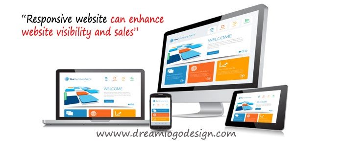
Making the webpage responsive involves all web contents starting from text arrangements to design patterns becoming well-adjusted to fit into phones, tablets, and desktops. With responsive design CSS and HTML codes, every component online visitors can find on the page gets resized with the screen space correctly. The designs and content shrink or enlarge to give an impeccable user experience and prominent view irrespective of your device.

 Why Your Website Needs a Responsive Design?

 Many causes reflect the significance of getting a responsive design.

Mobile Optimization

 A website with mobile compatibility can fit better with the mobile screen dimensions. A site having such quality gets more web traffic because most people tend to use websites from their phones.

So with high visibility and ease of use on mobile devices, a webpage gets a good influx of web traffic. Thus, a business can reach the larger market section if its webpage has a mobile responsive design.


Great Ease in Website Use

 No one likes a slow-loading website or a page that cannot display the content or pictures properly on smaller screens of mobile phones. When users feel at ease while navigating the website, they tend to stay longer on the site.

Further, they can understand the blog or business services or products better while browsing comfortably through the site. Thus with a responsive design, you give more clarity to online consumers.


Preventing Duplicate Content

While modifying your website, you can land up with two website versions. One is made compatible with mobile, and the other is for desktop. The presence of two versions can lead to the formation of duplicate content. Plus, the availability of two URLs with the same content confuses search engines like Google on which version to prioritize while ranking web pages.

But you can use responsive structuring of webpages to handle the issue of generating duplicate content. That said, the responsive design of webpages is never the direct contributor to avoiding duplicate web content. But making your website responsive can help you in preventing generating duplicate versions.

With responsive webpages, you get a single version of the mobile responsive website. That aids in avoiding the issue of having two URLs with duplicated content.


Enhanced Speed in Page Loading

When the design elements are incompatible with the screen dimensions, the page takes more time to load properly and gets readjusted with the available space. But the page gets readjusted smoothly when the design and page elements are responsive to the device change. Thus the page loads easily without consuming much time.


Minimizing the Bounce Rate

Bounce rate denotes the rate at which an online user leaves quickly after visiting the website. Leaving a site just after visiting is encouraged by poor page loading speed or bad user experience. With a high bounce rate, your website can never satisfy the algorithm of search engines and get a good SEO ranking.

Apart from having good content, the webpage needs to be responsive to give users a good experience. That definitely brings down the bounce rate, and people take more time to get familiar with business pages or blogs.


More Spread on Facebook, Instagram, or Twitter

When your website has a responsive design, it gives comfort and ease in website use. That brings more influx of online consumers, and they prefer browsing your web pages. Thus, you have more chances of getting your webpage getting shared across social media platforms.


Final Thoughts

A responsive design for websites is a necessary component in giving a better user experience. Apart from the role of giving improved user experience, responsive webpages remain essential for many reasons. With a responsive structure of websites, you can give ease and convenience to people who view websites from mobile phones.

Device compatibility remains a great driving force to incorporate responsive elements while making a website. You can browse responsive webpages without going through slow loading or struggling to view the website content as you move from desktop to mobile. Further responsiveness of a website helps you more easily understand the blog content, business services, or products. All in all, responsive and adaptive webpages hold the ultimate power to make online audiences know about your business pages or website.


FAQs


What Is Responsive Website Design?

A responsive layout for a website can be understood as an indispensable criterion for reaching a larger section of the virtual audience. The degree of responsiveness of a website results from making web pages that can be comfortably accessed through different devices and platforms. Responsiveness helps users easily navigate the webpage and get a good user experience.


What Is Responsive Web Design In HTML?

HTML or (Hypertext Markup Language) forms an integral part of website development. So undoubtedly, using HTML goes a long way in making a responsive and adaptive web design.

With strategic use of HTML elements, you can make image and text arrangements fit into the screen width of the device you are using. The HTML makes the webpage look adjustable and good irrespective of the device screen.


What Are Examples Of Responsive Design?

Responsive webpage design involves setting the width property of images in a compatible range to make the image fit nicely with the size of the device screen. That means the image shrinks or enlarges without losing clarity, depending on the device’s screen size.

Plus, you can consider changing the page layout in response to the device as an example of adaptive design. With flexible grids, you can get larger content condensed into compact sections as you move from desktops to mobile phones.


Why Is Responsive Website Design Important?

A website with a responsive layout is important because of many causes, one of which includes giving a good user experience. Another plus point of having a responsive structure is mobile compatibility.

Almost every user accesses the webpage through mobile or has a chance of doing so. That requires a mobile website design compatible with mobile users and shows the importance of responsive pages.


How Does Responsive Website Design Work?

Responsive structures or designs work by being adaptive to the device parameters and responding to changes. The design elements fit into the width of the device screen and find their suitable arrangement in the available screen space.

Also, the responsive site rearranges itself to fit with the device orientation. Notably, the responsiveness of the design elements enables no loss in color brightness.


What Are The Benefits Of Responsive Website Design?

With a website being responsive, online users can use the site with ease and without any facing any hassle. They don’t have to wait for the webpage to load and zoom in or out to see the content and images properly.

So, with a good user experience, you can get a good SEO ranking. Plus, with a responsive design, you can get good engagement from your consumers. They face no problem doing tasks like subscribing to a newsletter, clicking on action buttons, and downloading online documents.


Can Any Website Be Made Responsive?

Irrespective of the amount of design and content elements in the webpage, any site or page can be made responsive. With optimized use of page developing elements, any website can be made to fit into any device.

Why Customer Experience is the Ultimate Marketing Tool?

Customer Experience

With the fast development of technology and the introduction of new technical gadgets, the workforce is changing day by day, and the businesses must be prepared and well equipped to match with the rapidly changing business world. Although the digitalization of services replaces every manual work process, the process of delivering an excellent Customer Experience (CX) will always be there as a significant element of success required by the competitive businesses’ organizations.

According to a survey, 92% of the customers believe verbal recommendations of their known people rather than believing an advertisement wholeheartedly. The new and advanced technology options like social media and review sites allow the business brands to utilize these types of recommendations and reviews of satisfied customers as trustable credentials to attract new customers.

What is the customer experience?

Customer experience or CX is the communication and exchange taken place between a customer and a business organization throughout their business. These communication and exchange may include innovation, promotion, support, discovery, advocacy, service, purchase, awareness, etc. Customer Experience is very much essential for Customer Relationship Management ( CRM) as a customer with a positive experience can become a loyal customer of a business brand or organization. The longer the customers are happy and satisfied with a business brand, the longer they will be a loyal and repetitive customer to the business brand. On the other hand, if the customers are poorly treated by the business brand or are not given enough attention and support, the customers will leave as soon as possible. This is the reason the business brands provide better-quality customer service.

How is customer experience different from customer service?

Customer service, in general, is the formal interaction of a customer with an employee of a business brand over telephonic conversation or visit at the store. However, customer experience is the impression the customer has even after the formal introduction or the delivery of the required product or service. For example, if a customer receives good behavior while interacting with an employee of a tourism company while booking a tour package, it is excellent customer service. However, when the customer gets the tickets early, gets a better room than what was promised, and receives personalized services instead of general services, it generates an excellent customer experience. With the help of the advanced technology, nowadays customer service is not just the interaction between two persons, with the help of software’s like CRM, a customer’s previous purchase history can be traced and analyzing that, a company can assume his future needs while providing a service at present. So, the company can send him emails, texts and other forms of advertisements related to those requirements. It makes the customer surprised and happy, and he becomes loyal and constant to the company.

Steps to Improve Customer Experience:

If a business provider follows the steps described below, it can become successful in improving customer satisfaction and increased revenues.

Reachability: Reachability does not refer to the physical stores only; it includes the social media where the modern-day tech-savvy customers spend a significant amount of time. With the help of the social media account, the customers can easily reach to the services of the business brand.

Fixing problems: The business providers have to be very aware of the response to their newly launched products, and they need to perform continuous monitoring over the performance of the products. They need to find and fix any problem that the outcome might have before a customer finds it and experience dissatisfaction.

Do not harass users: Although email is a powerful medium to reach more customers and sell a product, a business provider should not send a bunch of emails frequently to the users. It might annoy them, and they may decide to unfollow the business provider. Some in-app-message services can be used as they are more relevant and useful than email marketing.

Personalization: The pizza brand ‘Toppers’ allows its customers to customize the drawings on the pizza boxes and adding a personalized message. By doing so, Toppers make the customers feel that their decisions and inputs are appreciated and accepted by the brand. It ensures a special bond between the customers and Toppers. Customers like to see their idea featured on the reputed brands.

Giving away free stuff: Everyone loves to get something which costs nothing, and this is a great strategy to enhance the customer experience. Personalized gifts, bonus, coupons, etc. deepens the relationship between a company and its customers and the satisfied customers become frequent purchasers.

Making people famous: If a company uses its customers’ photo and identity (with their permission) in its website, social media, blogs, etc. to tell their satisfactory words, those customers may feel themselves as similar to the brand ambassadors who will enhance the customer experience. The other customers will also recognize the company as a customer-focused one.

Remembering previous purchase: During a customer’s revisit a company website, if he sees his last purchase items as recommended items, it will make him remember his past interactions with the company. It will make the customer feel valued and appreciated by the company.

Final words

We can conclude to the thought that to enhance the relation and bond between the customers and the business brands, customer service plays a vital role. Customer experience is a sort of commitments that a company makes to understand its positive impact on the daily lives of its customers. By following the effective strategies of enhancing customer experience, a business can maximize benefits, boost up, and most importantly, grab new customers while making the existing ones loyal and regular customers.

How Does SEO Affect My Website?

SEO

SEO or Search Engine Optimization is a method which helps us to enhance the ranking of our websites in search engines like Google, Yahoo, Bing, etc., without paying for advertisements. When a person searches for a particular thing on the internet search engines, millions of results appear on the screen. Some of those search results are paid advertisements. The owners of the web pages and websites pay a certain amount to the search engine companies to get the top positions in the list or SERP (Search Engine Result Page). Others appear on the list based on their organic ranking. Those are not paid rankings; those are earned rankings based on the SEO. To rank a page in the SERP list, Google uses an algorithm which dictates search engine behavior by using two hundred different factors to position a site. However, not all the elements play a significant role in the preferred ranking, only a few of them help us to achieve our desired outcome. Some of the factors are described below.

Keywords:

Keywords are the fundamental elements in digital marketing. Keywords refer to the words which people use to search for a product online or want to see included in their search engines. Google Keyword Planner is a free tool that allows the users to choose suitable keywords for their business, which help to optimize a webpage or website. There are mainly three types of keywords: Generic, Broad match and Longtail. A website which includes all the three different types of keywords gets the chance to be on the top positions on internet ranking. Generic keywords are the general words which present a considerable quantity of untargeted traffic. These keywords are very much competitive at the same time. Broad match keywords supply an equal amount of traffic. These keywords are more like phrases, like “future growth in the hotel industry,” which are pretty targeted to the search words of the people. Long tail keywords are like the titles or heading of an article, similar to the lines people write on the search bar while looking for something, ” How to lose weight in thirty days”.

Mobile Friendly:

In the modern era, Smartphones, both the clients and the service providers depend on the personalized version of the websites available on their gadgets. So, a site which does not load on smart devices or does not synchronize its contents for mobile viewing may distract customers and lose business. The font size, image quality, small screen readability, tabs and navigation keys, etc. are the other things which leave an impact on the customers who search on their mobile phones.

Header tags:

A website with various headings with hierarchical pattern helps to grab customer’s attention by finding a premier position in the search result. The Header 1 should provide the title of the product or service while Header 2 and Header 3 provide short descriptions about it. A Meta description must be followed, which will be limited within 160 words. If a website includes useful keywords phrases in the Meta description and the headers too, chances of grabbing the top positions get increased. The page title must consist of the keyword phrases as Google analyzes the title first to find similarity with the desired search results.

Social Media:

Nowadays, millions of people are active on social media, and they prefer to share the contents they like on those social media. So, the more a product is shared, the more people will be reached. So a good website must provide information about their social media pages. The highest ranking pages in the search engines have the highest number of shares in Social Media.

Images:

Websites with good quality images which can be optimized for mobile viewing get the attention of the clients. Use of related keywords in the image description is also necessary. Search engines cannot read images, so the images must come with ALT attributes which help the search engines to understand the pictures.

URLs:

Search engines can focus better on URLs with one particular keyword instead of multiple ones. Hyphens must be used to separate words instead of underscores, as search engines read a phrase with stresses as a single word. A website with a static URL is helpful for the customers, as a static URL is easier to understand for human beings than a dynamic URL.

Latent Semantic Indexing:

A website with Latent Semantic Indexing draws more attention during the internet searches compared to the sites without this feature. Despite being a powerful tool to boost search results, not many websites are using it, which is a significant advantage for the website using it. It allows merely finding related keywords with the main keywords to present enhanced search results. For example, if a person types for “cheese” only, the search results show relates search suggestions, like “Mozzarella cheese,” ” Parmesan cheese,” “cottage cheese,” ” cheese pasta” etc.

Appearance:

A website with dull content and with little or low keywords fails to attract the attention of the search engines as well as the customers. Websites with proper heading, short but detailed product description and updated themes earn even better reviews. Speed is also an essential factor for a website to take a position in the search result. Google prefers domains which are more than a year old. A website full of technical errors is also a big failure in the digital market.

Responsive website can enhance website visibility and sales

Responsive Website

Online business is impossible without a website that we all know. But, only having a website so to say is same as not having one. The market is unthinkable competitive and having a professional look and advanced features are necessary. No one is going to notice your business online when it possesses nothing to interest or attract them. There are uncountable e-commerce websites which offer a range of products, starting from baby products to groceries. The unique features and offers your business provides should be highlighted in the website.

What is more important, is the layout, should be so designed and developed with user-friendly approach. Easy accessibility improves the staying time of the visitor. It reduces the bounce rate to be specific. Never try to ignore the need of responsive website design and development if you want your business to be successful online. Most of the people resort to mobile and other small screen devices like tablet and laptop. A properly designed site that can have a great view on other devices apart from desktop can increase the rate of conversion or lead generation. It’s completely true that we create to aim to earn good amount of profit in the business.

More use of flash files can make the website heavy and increases the loading time. It can reduce the number visitors as no one is going to wait for long for your site get loaded. Minimalism is the trending approach that gives a great web design. Website development should be so done that it requires minimum time to get load. The easy navigation can help the user to go through the pages of the website to get a clear view.

Now let us discuss the other benefits of responsive website designing

Adaptation to all devices

One of the most important advantages of Responsive web design service is that they provide a wonderful user experience across all the different devices without having any problem about the device’s screen sizes. The appeal lies in the fact that there is flexibility in its uses which is a typical characteristic of this advantage. All the websites optimized in this manner have a remarkably fair chance of having a universal look.

Support for all kinds of browsers

It is really difficult to work at SEO on the website of the same company on different devices such as mobile phones, tablets, and laptops. In short, it doubles the work of the SEO master. If there is a single website for both mobiles and laptops then there is slightly little stress for the SEO taskmaster. In this case, only a single link needs to be optimized. The benefit is that the website will gain more in popularity if there is higher performance rate.

Low cost & higher maintenance

The third feature is that the cost factor is minimized and inevitably, in turn, lowers the maintenance charge. The utility, in this case, is that the there will be a flawless flow of audience to the website without any hang-ups. The reason for it is that there will only be a single website instead of multiple websites which need to be optimized and this will result in lower costs.

Better user experience can really give you business success

User Experience

What makes a website successful? Is it the content? The design? The online marketing? What makes a website successful is a topic that I felt should not go unexplained seeing as more and more businesses are looking to the internet to present their identity, advertise and gain leads. It seems having a successful website is becoming more of an asset to businesses, large and small, than ever before. After some research as to how a website is successful, it turns out it requires content, design, and online marketing, but is a bit more complicated than that. There are some key ingredients, which are fairly self-explanatory, but could take another whole blog entry to explain their importance. Those ingredients include appropriate content, appropriate marketing (SEO, advertising, blogging, social media), and appropriate design. But there is more thought that needs to be placed in the design process, aside from making sure the visual brand is upheld, that can turn a decently successful website into a website that is responsible for generating 50%+ of total leads per month. And that thought process applies to what is called the user experience (UX).

The user experience is how the user feels when navigating through a website and how they may respond, physically (in terms of actions), intellectually and emotionally to the website. The way the user interacts with the website will actually help determine if they will take action and complete the overall goal the website was designed to incite. If the way a user might feel when navigating through the site is taken into account before and while the website is being designed, the final product will generate more leads.

There are many factors that go into creating an optimal user experience. They involve combining form and function to carry out a final goal. Breaking them down into steps will help give more insight into creating the optimal user experience.

  • Consider the industry the website will be applied to and the target audience that may become users of the site. How are they expecting the site to look and function?
  • Think of the goal of the website and what action you would like the users to complete. Is the best possible outcome a potential lead contacting your company personally? Is it purchasing a product?
  • When beginning to design the site, it is important to utilize the idea of flow. Creating this flow involves the visual design, content and navigation of the site. Is navigating the site cohesive yet stimulating, easy to understand, yet entertaining to peruse and keeps the user’s attention? In creating the main pages and sub-pages, it is important to make sure that the visual flow, as well as the flow of the content, are seamless to make the path to the final goal seamless. This seamlessness can also create a feeling of flow within the user. Flow, as an action, is defined as the state in which one becomes fully and positively immersed in an activity to the point they lose conception of time. Some athletes would describe flow as “the sweet spot.” When users feel flow, they are fully immersed in the exploration of a new and relevant website and are more likely to follow the flow and fulfill the ultimate goal.
  • During the website design process, it is also important to design with a human touch in mind. A user will respond more positively if the website seems as though it was designed for them and what they are seeking when visiting the website. Being as straight forward as possible with both design and content can achieve this, but adding some warm and/or humorous yet professional undertones can instigate the flow you want to initiate. If the user is receiving all the information they are seeking in a stimulating and efficient way, but also feel as though some thought was put into the presentation, as though they are interacting with another human in an entertaining way, they build trust with the website and, ultimately, the company and individuals that work for the company. Initial interaction with the user once the user has made contact is almost always more positive than if the site had been confusing and less welcoming.

While creating a website design that successfully includes all of these ideas might sound like it’s easier said than done, if incorporated into the initial brainstorming process and carried out throughout the design, it will still come through the design and make a noticeable difference in the final result.

Intelligent techniques and tools for web design

web design

This year is really actively one while we talk about designing tools hitting the market. Photoshop is no more the only escape, though it is one of the most finest one still plenty of other tools and weapons that are being employed by designers to create great industrial repute.

The line of difference between the designer and developer seems to become faint as static mock-ups has lost it’s importance. So working combined the tools also have to tailored accordingly for the best use. The year of Hi Dpi screen is in and has captured the arena for designers were in search of to create a designs that are easily accessible at various devices.

Pixate –
Pixate as a tool has been developed to making perceptive, interactive paradigm for iOS and Android. What makes it different the other options drag and drop elements and interaction panel.

Affinity –
Affinity created by Sherif closely resembles Photoshop and the app is faultlessly designed. Working using Affinity feels like it is developed to serve the web and graphics designers dedicated as a tool. The features like adjustable and nondestructive images that is, it allows to tweak the images or flat design images without distorting it. The high zoom level 1,000,000% is like a blessing to the designers whereas Photoshop offers 32, 000 only. It more useful while using vector designs. Easy handling of history and undo makes the app really smooth tool and to top it all it allows to undo up to 8000 steps.

Avocode –
Specially created for the ease of front-end developer for coding the websites from the format it has been created o the Photoshop or sketch. Brought in the market by the team of makers that has given us CSS Hat, so it’s quite guessable that they have made the exporting method to the next easier level. However, the previous tool enable to export assets, but what is best about Avocode is that it can use the Photoshop plugin of it to synchronize the PSD file to Avocode just with one click. It is so advanced to interpret and analyse PSD file turns flawlessly to UI design.

Macaw –
Macaw was created with the designers point of view completely. And this is so because it offers creating of responsive web design without changing even touching any coding, providing proper display for the mobile devices. The tutorial video will enable you to use and create a responsive layout within an hour that can serve the purpose greatly.

Conclusion: While you have so many tools for making the designing process easier and perfect then exploring those can be interesting as it was for me. If you are yet to check the effective tools and techniques just give it a shot.

Benefits of responsive web design in the business

Responsive Web Design

In the rapid paced world most of the things have its online identity, that is every product and services are searched online more. People opt to be at their place and just browse through the online stores to get their required items at their door step hassle-free. And to establish a distinguishable brand identity you have to ensure that you have the most user friendly websites. To provide the best user experience inevitably the website has to be responsive one that can be viewed clearly on various screens like in mobile, tablet, iPad and on a desktop computer. It is also an aspect of creative web design.

Nowadays, people rarely use desktop computers or laptops to find products and even to connect to social media sites. The e-commerce sites are the most searched for various required things in the day to day life that too on the mobile phones it is very handy and are suitable to search anytime. RDW makes a great difference in the perceiving of the user and leads to increase conversion rate, that is required for a successful business.

Nowadays, people rarely use their laptops and personal computers to access social networking platforms, e-commerce website and so on, whereas, they tend to depend more on their tablets and on their smart phones for browsing through it, as they are more handy and functional, thus being appropriate for those who are always keep traveling or for the normal office goers too. This is why responsive web design can make a great difference in the way the visitor comprehends a website and, ultimately, it can also increase conversion rate remarkably, an aspect that is especially essential for business owners. Here you will find out more about responsive web design, mobile-friendly websites and their benefits.

Now let us explore the other major benefits of a responsive web design:

Better ranks in Google Search Result Page (SEO)

No point, disagreeing that we create a website to get brand identity, web traffic and lead generation. This ought to be the most important criteria of a business owner, be it a small or big business, it can establish better it requires continual traffic and conversions. Now let’s find out how responsive design works wonder for the same.

When you have a responsive web design it is flexible for all screen types and devices apart from that you don’t have to invest in creating a different versions for different screens. The URL remaining the same you SEO gets stronger and leave your worries for getting another one for iPhones and other devices. Even Google claims that a responsive website has chances to rank higher.

Improved sales and Revenue

As I mentioned in the previous paragraph that responsive design leads to more traffic generation which in order increases sales and revenue. Being responsive you have only one version of a website that provides us with a single style sheet (CSS) for a better consistent in terms of user experience as this ensures longer stay of visitor on your website viewed from any device. Better user experience ascertains more leads or more sales.

Increased offline user experience

Many of the android phones and tablets justify HTML5 that serves best offline browsing features. This feature enables users to read email, newsletter perfectly well even if they do not have an internet connection.

Why is Responsive Design Profitable for Ecommerce Business?

Ecommerce Business

By this time you must have heard the term responsive design many a times. Now, the question is what it implies and what is it useful for? So, let me make the concept clear to you as this web design format is going to prevail in the web world more in the coming years. Responsive web design is adapting the tools and opting the format to make the website friendly for all the screen types including, laptop, tab and mobile phones. It is highly recommended for e-commerce websites as it requires to be receptive. Web surfers prefer to surf on various platforms according to availability of the device at that point of time. For instance, you want to order a gift for your friend and you have no time to hop in to different stores, and you need to search on mobile, so the website should be mobile friendly to be viewed without fuss. In order to have a perfect display on small screens it needs to responsive. It has been seen that most people use mobile and smart phones, 60% more for local searches and go for it. It is evident that to acquire more business successfully you need to have a mobile friendly website.

Reasons Why Responsive Web Design is Necessary for ECommerce Business?

Fit for all screens: These design formats can ensure the best viewing for any screen size. Previously websites were only made to suit the desktop computers. After the increased use of mobiles and other smaller devices, it became an indispensable need to have a design for a website that can be viewed on all smaller screens without irritating the user. If a website not responsive then it is unreadable, links jumble up and images break for the smaller screens. Overall, nothing can be gauged from this type of view.

Clear View for Accessing the Features: If we consider the usability factor, these websites are much more upgraded than the previous ones. Every feature can be easily used without any problem like it used be for the desktop instead of looking like a maze for the users.

Added Advantage is cost-effective design: It is cost-effective for the business owners as they don’t have to spend more on designing a website in various versions for different platforms. Equipped with advanced tools and technologies present day designers guarantee that one version of a website can fit in all screen types, making it lucrative.

Flexible Design and great adaptability: Content and images that are used on these websites can adapt with the up-gradation of technologies and leave options for modification. This makes the designing part easier as they don’t need to change the thing completely and maintenance of the website becomes lucid.

Reduce Bounce rate: ‘Bounce Rate’ implies the percentage of viewers in your website that leaves the site without staying at it for more than 10 seconds, that in order decreases the rate of conversion. Bad navigation, slow page loading are some of the reasons for increased bounce rates. Responsive site designer ascertains low bounce rates by making the navigation panel easy and increasing the usability of the website.