Tag Archives: Web designing services

Points to be avoided while designing a website to make the business successful

Website Design

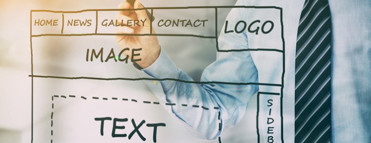
Though a big or small venture the website is the only platform for marketing and branding. Web visitors to come to your website and it’s your responsibility to change them to potential customers through the web designing and other features in the website. They must get the answers to the query they have about the product or services you are offering. If the design of the website goes wrong by any chance you can face a great loss at the initial stage. So for the proper functioning of the business online you have to make the website design perfect.

Some useful point to avoid while creating a business website design:

Take time to understand the target audience-
The intention shouldn’t be getting a website done as fast as possible, whereas before designing the layout you must derive information about the target audience in the market. Then create the layout keeping the demographic in mind. For instance, if your market audience is comprised of the senior people, then using bigger font size can be useful. Or you see your target audience youngsters then you can have the features on your website that will make it more compatible to mobile devices.

Avoid making it too flashy-
To make your website popular it’s not about flash design, but you need to do proper marketing of the website. Overuse flash or a flashy design will only attract the visitors will not give you sales while increasing the page loading time. When your website takes more than the 3 seconds every visitor gets annoyed and leaves for the next option. To make the people go to browse through the pages you need to have a simple design that makes the utility of your product or services. This will help them to decide whether to go for it or not. Additionally, flashy design looks bad on the smaller screens like smartphones and at present most of the internet users surf the website through mobile devices. Once the user comes to a website, he already knows that what he wants and it will hardly take him 3 seconds the if the design is confusing to navigate.

Unclear CTA-
When a user comes to your website, what do you want them to do? You want them to make a purchase or subscribe your blog or newsletter? So, it’s you who guide them about the next action. The content on the website should provide the points that can clear their queries and the call to action button will help him to finalize action giving you a conversion.

Trying DIY techniques-
The website is the platform for the users to have the first experience with your brand. Without a professional skill can you provide the users the better experience? Ones if you fail to impress the visitors you lose the vital number of the customers as the first impression is a lasting one. Whereas you can be assured of better results with a professionally designed website.

5 Ideas to design a website that can keep the Users Happy

Website Design

Developing relationship with users or customers is an essential part making a business successful. At present in the world of innovation you need to provide the best experience to the user in order to make them stay as a loyal customer. Of course user friendly sites fetch more amount of audience as no one has the time to hunker on for something that needs a lot of time while they are flooded with other options. Not only that sharing their his views with others with the help of social media platforms or on other websites can adversely impact your business. So it is very crucial now to create better experience for the user to provide the business a good reputation. Website designing may look simple task leaving the business entrepreneurs pondering whether they should go for a professional help or not. Some of they may opt for online designing software rather than hiring a web design services This may look beneficial apparently but is not effective online as it will not guide your design to be seo friendly or in the aspects where designing can match up to the trends prevailing in the industry. Here are some of the points that can help the help to have a great business website that can entice the masses.

Selection of color or the color theme is important:

Dark background have a good look and feel so using light color elements on it creates a soothing effect on the eyes of the visitors. Whereas the use of darker color tone on lighter base can give a dull look and compel the user to move to the next option. But only the professional have the correct knowledge of the color scheme.

Proper visibility of the cart:

Significant for those business owners who have e-commerce sites as its beneficial for them to have the cart visible 24 hours. It should be so placed on the pages in a specific area where the user can locate it easily and the size also matters. Not only this is must also display the number of products added to the cart for the knowledge of the customer. A chunk of people shop online and the worse experience will be if they find after coming to the check out page that only some of the products have gone added to the cart. This will definitely put someone off, so it is essential to add the cart properly to the page. The easy accessibility of the website design
will increase the chances of the customer returning back .

Flexible Compatibility:

Gone are those days people use to browse through only through a desktop computer. At present websites require to be responsive that suits all screen types like on mobiles and tablets. Those websites that don’t have a proper design to suit all the devices can lose a great amount of traffic.

Avoid clutter

it can be useful adding some call to action buttons in the bar or on the side of the head banner, but sometimes it is not effective in the long run. Instead professional opinion to have an informative and relevant content and only one call to action button that looks cluttered-free.

Minimalist Approach is the trend in the Web design world

Web Design World

Minimalism may sound very simple, but if we see in depth it is much more than just being “bare minimum.” Thinking minimalism is just so easy as it sounds might be a incorrect conception, as there are less elements with which you can provide the same features to the minimalist website for the convenient use of the visitors. To maintain a proper aesthetics with the same functionality, the web design becomes more meticulous. It can be said as combination of smart use of space, impressive visuals, impactful typography and most importantly the content has to be focused by all these.

It is one of the most effective ways to create an attractive yet simple website for a better user experience. There are 5 elements that make the approach minimalist in true sense and people appreciative for it. No points guessing that it has become a trend setter and popular style at present, you can also know required points below:

1. The concept of Negative Space

The foremost design element that maximum people relate with minimalism is space, to be precise, it is termed as the negative space and more of it. But we must know that it’s not just a small design restricted with colorless scope. This approach also allows use of any color, though patterns are not advisable in this context. The most preferred backgrounds are the base colors, white and black, but for uniqueness some of the designers use colorful backgrounds in subtle ways. Negative space is effective in influencing the visitors visual flow, unhindered as the more negative space around the focused element draws the eye of the user to that element. Along with the above mentioned benefit negative space helps in better placing of the other required elements, restricting the design from overpowering the site visitor and are specifically better used for inner pages.

2. Big and Graphic Photography

It is not that every designer will have a same approach for this layout, some may feel that minimalist websites are way too distant emotionally, so bigger pictures can add a hint of familiarity without laying any effect on the foreground. The most spectacular art element in minimalist design is hero headers and images, that are defined by prominent slider created by the top scroll. Pictures used should justify all the minimalist features or else you get less benefits of the design. For example, choosing a wide picture of wall or empty place can be impressive, but a picture full of any items negates the advantages of minimalist interface.

3. Dramatic Type Interface

Like any other layout minimalist design also cannot do without words, they are vital elements. The typography selection should be apt and customized typography can be the point of focus here. it brings the attention of the user to the content that conveys the company message.

4. Lucidly Simple Navigation System

Minimalism requires hamburger icon. Simple design teamed with the aesthetically simplest navigation system can be the best for the users. The popularity of hamburger navigation is even compelling veterans of minimalism to change to hamburger navigation and icon for the best implementation of UI elements.

5. Striking Contrast

Use of the white background is mostly preferred by minimalist designers the cause, it is the most convenient canvas to play with color for setting a proper tone for the website. It is like the hallmark for the minimalist to select black or white background that creates a magical effect when combined with bold images.