For any business to get established have some prerequisites and a logo is one of them. As the saying goes ‘first impression is the last impression’ holds true for healthcare sector too and logo helps in creating the first impression upon the viewers. For hospitals, nursing homes and healthcare organization having an impactful and professional logo is important, though getting the same is complicated task and only experts logo designing services can help you out is this aspect. So here are some of the points you needs to check out for creating a strong brand identity through a meaningful logo design.
Your clients can readily recognize your brand with the logo associated with it trough the signage, banners in this competitive medical industry. It has to borne in mind that medical logos have to be exclusive and effective.
Easy Concepts are amazingly effective
Some of the most impactful logo has a simple concept. The basic thing is that your brand identification should speak of your quality services and allegiance to your services though graphical images and text. For getting an idea you can check on other competitors that exist in the industry. You can get inspired by the ideas but remember the design needs to be distinct and innovative.
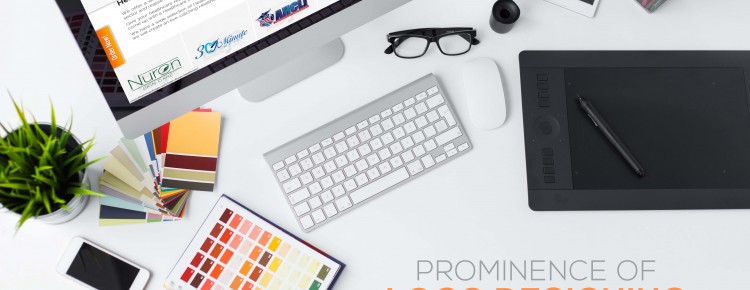
Selection of the component for your brand identity
In case of brand identity colors are very significant so must be selected carefully. While it should be attention seeking at other hand should have a professional appeal. For example, black fonts on the light color background like that of gray and a dash of color in the patterned back ground can be impressive for onlookers. Complex font type can make the text bizarre for the audience and will not be readable from distance, so it is better to avoid these kinds of fonts. According to the graphic logo design trends if you want to have identification created for pediatrics services you can of course go for some funny fonts and that also underlines your services.
Illustrations or Graphics for Your brand recognition
According to the specialized services you provide, there are assortments of graphics or images, signs, symbols. Talking about the graphics that are seen commonly is little overused, so creating a new concept by help of a professional Healthcare Industry Logo services can be wise. Every branch of medical science has its own share of graphics like, dental clinic can portray scintillating tooth, orthopedic clinic can opt for a image contain a fitness of bones and the best for pediatric clinic can be graphic of smiling baby.
Some points to avoid for getting a state of art Healthcare logo
- Excess use of complex medical symbols. As they get mingled in people’s mind and will not work well.
- Use of various types of fonts in text can give it a jumbled look it and will not be clear in glance.
- Using a hologram effect or color-shading effect. A medical logo always looks better in simple layout and though base colored pattern can be used in the back ground.