Tag Archives: flat logo design

Why Opt A Flat Design For Your Computer Company Logo

Company Logo

As the other aspects, technological advancement has also influenced the field of graphic design. With developing gadget technology, the evolving forms, and principles of user interface design and connectivity types, the graphic design has also developed to get an all-inclusive nature. And one of this upgradation can be seen in form of flat design and undoubtedly stepped into logo design trends too.

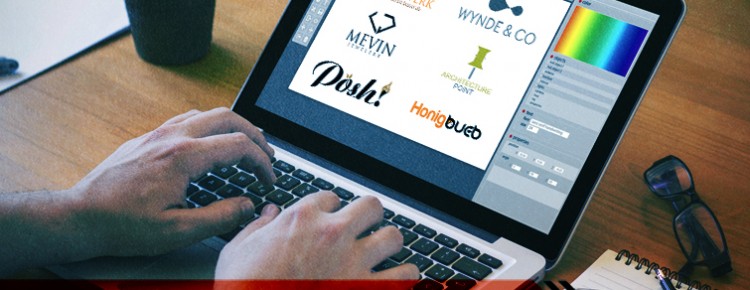
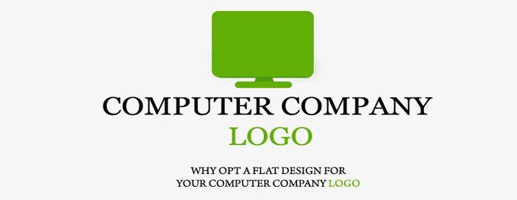
Let’s see it through the industry that has utilized the trend for remarkable results, computer companies. Flat design something so amazing in terms of designing it is difficult to ignore. It has a great presence and has all the required elements that can aid designers to select it for a logo design preferably. In the course of time, people have increasingly connected flat design with gadget and technology and for obvious reasons, the set of graphics is used in computer logos. As logos are the representation of what the brand does, so flat design really approaches to serve the best.

A small note on flat design

Flat design achieved popularity in the web designing arena in the year 2012. A flat design is simply a design pattern that doesn’t use any 3D or glossy effects and repudiates whatever gives a realistic look and feel. Whereas, it beholds features like getting the concept crisp, clear and clean. In this sense, you can think it as the improved version of a minimalist design. The charisma and charm of flat design is its clarity, simplicity yet the immense power to convey the thing with much ease.

Flat Logos Vs Skeuomorphic Logos

Flat design logos are just the converse of Skeuomorphism or realism. Skeuomorphism is the design pattern where all components act as a metaphor and resemble a real-life illustration. Although, both Skeuomorphism and flat design used by computer companies for logos the later one is trending now. Realism style gives a 3 dimensional or raised look to the logo design, but the flat design is just the opposite it will have no extra detailing, no ornamental features, we can say no use of gloss.

Benefits of flat for computer brand logo

Flat design gives a clean look and feel

Not only flat design logos are uncomplicated to look at but is also more memorable. Our mind always perceives simpler designs better and this the reason flat style us advantageous while simplicity is one of the basic principles of logo designing.

Flat logos can suit with various branding components

your computer logo will require great versatility as it must be apt to be represented on billboards, stationery, brochures and sometimes infographics. So, while designing scalability is a prime factor to look for and flat design enables the needed versatility. It has breathable white space and clear look and can be customized for all the branding campaigns.
Facilitates to create bold statement with colors

As flat design allows additional design elements, they necessarily depend on colors to create an impression. It means flat design enables you to experiment with unusual hues. This can be a great advantage you can nail it with the help of bold colors.

Logo with flat design is Responsive

Yet another benefiting factor with versatility flat logo design is that it will be perfect for viewing on mobile devices. This makes it clear that it has high scalability which is another significant factor for a professional logo. It is apt to be viewed on mobile devices like laptops, tablets and smartphones.

Why flat logo design is trending in the industry

Flat Logo Design

In this changing world, trends also keep changing. The only difference is some of the trends last long and are profound while others are feeble and don’t have much impact. One of the logo design that is alluring the market since 2015, is flat logo design, extending to flat design for websites too. It is evident from the logo designs of the famous brands and even for many of the web designs of late.

Let’s see now, what characterizes flat design? We can summarize it as that aspect of designing which is based on minimalism and doesn’t adhere or removal of all kinds of 3D effect. For example, you will never find use of theses features like, drop shadows, patterns or gradients as this three stylistic constitute to provide an impression of depth. We can even find many websites that is created only with flat design to prove its prominence in this industry.

Flat or vector design generally juxtaposed to skeuomorphism that is design basis that gave rise to popular implementation of 3D format in the web world. Previously the renowned brand Apple use to portray a logo that advocated large use of skeuomorphism, but after Steve Job, they did not stick to it anymore and opted for a flatter design for its most popular products.

Now, exploring about it in more details will give us a clear picture of its reason to be so popular.


We can see prominent brands choosing flat logo design over other form:

As I have mentioned earlier a big example is Apple, that was completely away from the flat designing trend, but now the logo the brand represents justifies all the criterion being a flat one. You can see the icons and buttons are different not from 3D designs. One of the major reasons of the wide use is due to the rapid coverage. Flat designs have enveloped in numerous outlets during the last year, ranging from Forbes, Apple, even Microsoft in 2006 tried opting the design pattern and used it in their windows phone 7. Obviously, the craze for these products also increased the reach of flat design taking a definite place in its large customer base. Last but no the least, we cannot forget last years launch of iOS7 and its buttons and icon looked flatter, the shift was noticeable. Professional logo design companies also marked a switch over in preferences of the site owners and audiences.

For that mater, it left no medium untouched, if we talk about Facebook, looking at its icons and buttons we can clearly see the prominence of flat design. We track the change from the last year it will be helpful to gauge the difference, as last year it took over to the flat design for its logo on its different pages too.

How about considering the advantages:

The advantages flat or vector design portrays is also among the reasons of its ruling the graphic logo design industry. These are benefits are different and provide completely stylistic, but also look very professional practically. A close view will help us to elucidate:

Clarity and Neatness

As the design is created on minimalism and simplicity it gives a very neat and coordinated look. A neat look in case of logo is very impactful as it communicates your brands identity most efficiently and results in easy understanding of the customer.

Suitable for Mobiles too

Flat designs are mobile friendly that other designs formats, specifically skeuomorphism. Though a debate can arise as previously 3D buttons and icon were more loved by people on mobiles but to our supersize time proved that developers observed that flat design suits effortlessly on mobile screens than other approaches.