
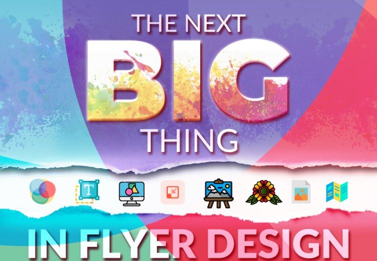
The Next Big Thing in Flyer Design
Flyers or leaflets are advertisements printed on papers which are distributed manually among people in public places or sent individually. A brochure can be used to promote business, announcing sales or discount on products and services, new opening or inauguration, or even to spread social, political or religious messages. Flyers are generally the cost-efficient medium of marketing and promotion, coming in variants like black and white or color, regular paper or gloss paper, etc. The commonly used sizes of the flyers are A4, A5, A6, DL, etc. Flyers were invented in the 18th Century, but it continues to exist in the market even in this era of digital marketing. Through years, leaflets have been subjected to innovative experiments to reach a wider audience, which made them difficult to ignore.
Vivid Colour: Since most of the flyers are printed on paper, so the color scheme used for writing them is CMYK (cyan, magenta, green, black), not RGB ( red, green, blue). Pop colors and pastel shades are set to dominate the color palettes. Vibrant contradictory, as well as complementary colors, can attract an extra amount of attention. Since colors are responsible for deciding the viewer’s mood and perception, the color temperature (cold or warm) can help to choose a cohesive color palette. Vibrant blues, bright corals, and electric yellows are set to dominate the color scheme in the upcoming years.
Typography: With the invention of new fonts almost every day, the fonts will be the next big thing in the field of flyer designing. During the previous years, we have seen the use of bold fonts as complementary, but now these bold fonts are ready to set the center stage. The extra large and extra bold fonts will grab the focus point, speaking for themselves, without any supporting images or graphs. Apart from the bold focal fonts, bright colored, clean and legible fonts matching the subject and theme color will bring freshness in the design.
Futuristic Designs: Holographic and reflective graphics, geometric lines, abstract patterns, glitches, etc. against a dark or bright background color will put in futuristic elements in the graphical appeal of the flyers. The use of duotone color scheme will also bring freshness in the design as it merely replaces the black and white colors with two other selected colors. The upcoming years will witness the rise of the complex gradients. All those years, gradients played the secondary role being pushed in the background. However, now, Texts, images, designs, and other primary elements will be subjected to gradient experiments.
Minimalism: Some people often misinterpret minimalism as the use of black and white color only against a simple backdrop with a little or no graphical elements. However, minimalism refers t the elimination of any insignificant and unnecessary details and sticking the design to the essential and related components. It’s all about taking the complication away from the flyers. In the upcoming years, the traditional minimalist use of black and white will combine with the use of splash colors. Simple black fonts will be seen against gradient color palettes instead of the tedious and dull shades of white. Simple black and white background color schemes will come together with geometric patterns in electric or coral shades, which will reduce the monotone.
Illustrations: During the previous years, doodles became a massive hit in flyer designing. Graphics composed by drawing simple lines became so popular that almost everyone started to copy that trend, which made it no longer unique. This year is going to be dedicated to hand-drawn graphics instead of linear graphic doodles. These hand drawn graphics help to add an extra charm and uniqueness as well as a personal touch in the advertisements. Also, those hand-drawn graphics and illustrations are not easy to be copied by the market rivals.
Old School Charm: Apart from the handmade illustrations, the vintage and retro-themed designs will continue to exist for the upcoming years experimenting with bold or neutral color schemes. The Old school designs serve in two ways. First, they successfully create a nostalgic effect of the bygone days, on the other hand, standing tall with unusual features in the crowd of the different contemporary designs.
Photos: Photos have been an essential part of flyer designing for years. Well edited photos taken by the professional photographers had been a significant part of the designs. Instead of those edited and polished photographs, clear, natural, and realistic images will be added to create a down to earth appeal as if they were taken on mobile phones or someone’s Instagram profile. Ultra-generic photos now create a cliché effect due to overuse so that they will be dropped this year.
The Impact of Folds: The most common and widely used format of the flyers is the unfolded sheet of paper with one side or both side printing. However, from now on, different folded paper designs are set to be game changers. Half-fold, tri-fold or spiral fold effects can bring uniqueness in the flyers. Moreover, different parts of the folds will display different types of information in an organized and sequential order.
QR Codes: The essential part of a flyer is the contact detail for further inquiry. Till now, mobile no., email and address have been a part of this category. However, this year, QR codes will change the trend. Smartphone users can quickly scan the QR codes and get to know more digitally. Thus, those codes will bridge the gap between a printed commercial and a digital one.