
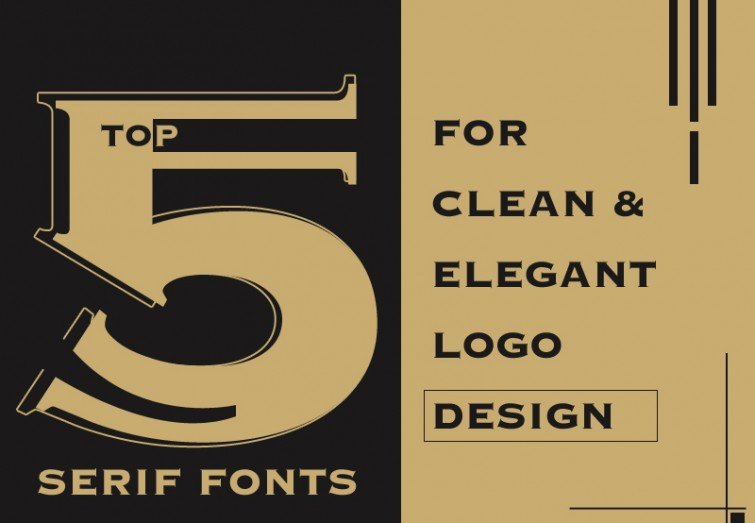
Top 5 Serif Fonts for Clean & Elegant Logo Design
Which fonts are better: the Sans-Serif fonts or the Serif fonts? This question is one of the most argued questions in the graphic designing industry. Some say that the Serif fonts are better for the printed materials while the Sans-Serif fonts are suitable for online campaigns. At first, one needs to know what are the primary differences between the two types of these fonts and for which purpose they are widely used so far.
Sans-Serif fonts: The word ‘Sans’ came from the French language, which means ‘without’ and the word ‘Serif’ possibly came from the Dutch language, saying line or stroke. Sans-Serif fonts do not have extended stokes or lines at the end of the letters. These fonts are generally clean and straightforward, without any ornamental features, so they are widely used for headings. For writings on the digital medium, Sans-Serif fonts are used as they are readable at any resolution and from any length of distance.
Serif fonts: In typography, Serif fonts have letters with lines or strokes in the end. In spite of this, the advantage of using Serif font is that they can be read with comfort in the rough book paper. However, some say that Serif fonts are not appropriate for online or digital readability since those additional strokes in a letter can misguide the audience for another note due to distance or low resolution. Nowadays, graphic designers are successfully using these fonts in the logos, headings as well as in the body part of the text. There are mainly four types of Serif fonts- Old style, Transitional, Didone, and Slab Serif.
Serif Fonts in Logo Design
So what are the characteristic features of an excellent logo? A good logo must be simple, memorable, timeless, versatile, and appropriate. A logo represents a company graphically. It is a visual element which helps a business to create its own brand identity without much explanation. This is why a logo is mandatorily printed on the products, campaigns, advertisements, and websites of a company.
For the last fifteen years, Sans Serif fonts dominated the world of logo designs with fewer exceptions but now, thanks to better experiments with typography, designers are using Serif fonts to create clear and robust logo designs. Here are seven Serif fonts which are making a bold visual impact in logo design.
Hermann: One of the most readable Serif fonts is Hermann, which was designed by Diego Arvena and Salvador Rodriguez, in 2018. Inspired by the works of Herman Hesse and Aldous Huxley, these two designers implied surrealism and duality along with boldness and wildness in the design. Consequently, the font comes in ten variations mixing accuracy with legibility and boldness.
Recoleta: This font merges various fonts used in the past to present a new font filled with freshness and modernity. Blending the gentle, soft shapes in the Cooper font and the fluid angled strokes in Windsor, Jorge Cisterna cheated this beautiful font perfectly suitable for unique logo designs. Offering a variety of weights, this font allows the user to choose the best typographic color for his project.
ITC Lubalin Graph: This font belongs to the Slab- serif font group, and it helps the logo to convey a sturdy and no-nonsense look. With lighter weights, this font adds a modern and eye-grabbing feature in the design. Although ITC Lubalin Graph was designed in 1974, this design was based on another design by Herb Lubalin called ITC Avant-Garde.
Linotype Didot: Adrian Frutiger’s tribute to the Didot family of France who was active designers for abbot 100 years during the 18th and 19th centuries. They were printers, typeface designers, publishers, inventors, and intellectuals. This family-owned the essential foundry and print shop in France in this era. This font design is a sensitive interpretation of the French Monotype Didot. This font is capable of adding a classic and elegant feature in the logos. Apart from logos, this is excellent for headings of books, magazines, posters, and advertisements.
Gabriela Stencil: Suitable for fancy logos and headlines, this font puts stress on the modern and elegant font style, borrowing inspiration from the Didone typefaces from the 19th century. Designed by Antonio Mejia 2016, this font is also ideal for short texts, publishing projects, and branding. Although it belongs to the Serif family, it is highly readable since it has short ascenders and descenders. It comes in six styles containing a set of 433 characters which can be used in 200 different languages.
Conclusion:
A clean and elegant serif font style not only adds sophistication to the design, but it adds an exciting flair and breaks the dullness of the design as well. Experimental logo designers prefer the Serif fonts as the various types of the strokes or flares help the logo capture the mood of the products and grab the attention of the audience being different from the other designs.