
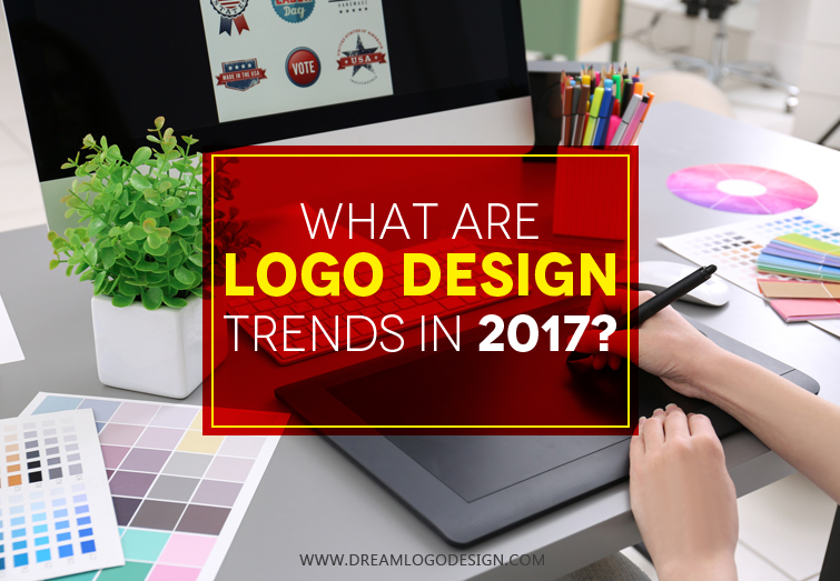
What are Logo design Trends 2017?
Every field happens to develop with the passing time certain techniques continue through years and some is replaced by any advancement. Logo design is no exception rather it keeps on changing basing on the preferences of the audience and for the betterment of the prior prevailing trends. The bran emblem is always a significant part of a business and to create a sensation in the market the brand mark should be exclusive one. It must convey the brand essence in a way that can appeal to the audience. It may look simple to design a logo but it's not so as creating a unique and apt design requires great knowledge in this field and familiarity with the trends. Otherwise things can go wrong. For example perfect selection of colors for any company brand mark can be more convincing for the target audience than a clumsy one.
The familiarity with the prevailing trends allows the designer to know the liking of the people. Moreover, it will allow to know the nuances that the internationally famous brands are using which can be very inspiring.
Let us discuss about some of the logo design trends of 2017:
Literal Minimalism At present logo design more preferred are bold, complex and gimmicks fail to attract views. Rather the simple designs are catchy and evidently, the flat designs are being the more preferred trend in this arena. The minimalist approach is conveying and practical. It serves the purpose efficiently and makes the customer understand the concept easily and this is another reason for it being in trend from past year.
Hand-Drawn The graphics that creates a hand-drawn effect was trending in the year 2016 and seems to be getting more significant this year. The main reason for this being the authentic look it provides to the logo. In getting more prominent in food industry that is for restaurants and hotel brand images. Hand-drawn brand marks provide touch of personalization, credibility and attractiveness are the attributes that makes it popular.
Negative Space The concept of negative space is based on dual-imagery. Which means both positive and negative space both have equal importance in creation of the design. Both claims viewers attention. We can take the example of the logo of Formula one company. The distinct space forms the '1' between the black colored 'F' and graphical red meaning speed or energy makes it look more creative and there is smart use of negative space.
Line Art Though Line art started to gain importance in 2015 its still accepted and holds the position of being popular in the present year. This approach generally haves the features like thick lines as the name suggests and integration of solid colors makes the design look prominent. This can be used by the companies that want a fun element in the design.