
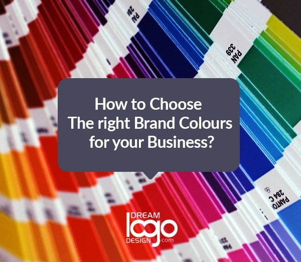
How to choose the right brand colors for your business?
Introduction
Colors can convey a lot of information, whether it's the yellow helmet of a construction worker or a bride's pristine gown. A color palette plays a crucial role in any business's branding efforts because of its strength and immediate impact. From the look of your logo to the design of your website, you should choose the right color scheme for your brand. Using the same color consistently across all platforms allows you to create a unified look and feel for your company, making it memorable and recognizable.
What are brand colors?
Brand colors are defined as a group of five to ten colors that represent a certain organization. It is possible to increase brand awareness and recognition by applying brand colors consistently and strategically. In addition to a company's logo and website, brand colors are also used in social media channels, business cards, and print and digital advertisements. In brick-and-mortar businesses, the brand colors can also be applied to the design of the store, staff uniforms, product packaging, and more. Now, the question is how to pick the right brand colors for your business.
How to choose your brand colors?
Choosing the perfect brand colors is very much important for your business. This comprehensive guide will cover everything through a step-by-step process to choose the right color for your brand.
Establish your brand identity
Brand identity is reflected in your brand colors. Therefore, your color palette should match your values and the messaging you wish to convey. Identifying your brand identity will be the first step in this process. The best way to do this is to compose a list of adjectives that describe the character of your company just like you would describe a person. You should consider how you would like your brand to be perceived, and what makes it unique.
Explore the meaning of the colors
After identifying your brand personality, it's time to choose the colors that will bring it to life. To understand the meaning of each color, it is important to look into the principles of color psychology. Combinations of colors also play an important role here, as they contribute to achieving a look that evokes specific feelings through their juxtaposition. For example, the color blue, when it is paired with gold, conjures up notions of royalty and luxury, whereas the same blue paired with pink seems much more playful.
List of Some Popular Brand Colors Used by Some Key Industries
Here, we have compiled a list of popular brand colors used by some key industries that will help you to pick a color palette that is appropriate for your business:
Food:
Colors such as red, orange, and yellow evoke appetite and attract attention for food and restaurant businesses. Some food brands use green to promote connection with nutrition and wellbeing, while others use blue and pink for sweets and desserts.
Health and wellness:
Blue is a popular color choice for health and wellness companies to signify cleanliness, trustworthiness, and responsibility. Other popular choices are green, which represents nature and wholesomeness, and orange, which is associated with vitality and energy.
Fashion and beauty:
Black has become a symbol of sophistication and glamor within the fashion and beauty industries, while warm colors such as red, orange, and pink convey passion, excitement, and confidence.
High-tech:
It is common for tech companies to use blue, a color symbolizing trust, intelligence, and efficiency. Other popular choices are orange, which represents friendship and optimism, and purple, which represents quality and creativity.
Search for inspiration
You should look around for color inspiration before you craft your brand colors. Also, try to understand how your competitors' palettes work, and what it is that makes them successful. You should consider what you can learn from their color scheme, and how you might differentiate yourself from the competition. Now, the question is how to pick a color palette for your brand? Online color palette generators are also a great source of inspiration where you can find a variety of color pairings and fascinating shades.
Pick your primary color
The primary color of your brand is defined by the color that is mostly associated with your brand. Your primary color should represent your business best based on the meaning of colors. The color you choose can be blended in many different ways, from lush and dark, to soft and pastel, to bright neon, to find the perfect look.
Choose your secondary colors
After you choose your primary color, you can match two to four complementary colors to it. You can either display these colors independently or together next to your primary color.
Different color schemes of secondary color
The secondary colors of a brand can go in several different directions:
Analogous color scheme:
Your primary color is closely related to these colors. As a result, if your primary color is bright red, you can add other warm colors (such as oranges and yellows) to create a balanced color scheme. The appearance of analogous color schemes is usually harmonious and pleasant.
Monochromatic color scheme:
Each one of these is a different shade or tint of your primary color. For example, if your primary color is blue, you can use light blue and dark blue as your secondary colors. It is possible to strengthen and enhance your core color through monochromatic color schemes.
Contrasting color schemes:
Contrasting color schemes can either be complementary shades or a combination of colors with contrasting hues. You can use this color scheme to make your brand colors pop, and it usually conveys a fun, modern feel.
Select neutral colors
At the time of crafting your brand color, it is easy to focus on the main colors and overlook the neutrals. But neutral colors are important because they are responsible for the majority of your communication (such as the color of your written text) and appear in the background of most of your assets. White or black is the traditional neutral color, usually combined with gray shades.
test your brand colors
As soon as you've chosen your colors, put them all together and test them in a few different combinations to ensure that they complement one another and convey the message you're trying to convey. If you want to make your website accessible, you should also make sure that the palettes are clearly legible together. Color contrast can be tested for accessibility through various online resources and browser plugins. The two tools we recommend are the Contrast Checker and the Colour Contrast Analyser.
Conclusion
If you're starting your own business or launching an exciting new startup, understanding the impact of color on consumer behavior will make your business successful. Colors evoke feelings as well as emotions, plus they also convey information. This enables customers to form an initial impression without knowing anything about your product. So, pick a palette that aligns with your business.