
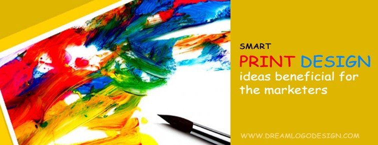
Smart print design ideas beneficial for the marketers
Association of a brand or a company with a well-designed logo is common. This very association is created with a process that ensures every piece of the jigsaw fits correctly. And the result is a finished product that the world will encounter and if done well even remember.
During this process of fitting the bolts it is very important that the designers and the marketers are on the same 'page' and have a few essentials covered so that the process gets easier and provides the desired effects.
Here are 5 things that can guide a marketer to tune up his print design.
Enjoy versatility but don't compromise on uniformity
We all love versatility - be it colors, texture and unique techniques of styling. Why ignore it when it comes to print design. Versatility will always be an added advantage when working on a particular brief. In today's world of multimedia it is crucial that the logos designed or branding should be flexible so that it can be used for printing and utilized digitally too. To achieve this purpose designers should be aware of the technical know how related to printing process and take into account the format, quality of paper (to be printed on later), colors and detailing in the design so that the design is a flexible one that is easily put to use on multiple platforms without compromising on uniformity.
Balance your act - stay web and print-friendly
Formatting plays an important part where printing is concerned. It should be such that it allows the design to be printed on the business card as well as banners and posters. Therefore, it is always advisable to design in EPS or vector format as both are scalable and allows for small and huge prints and it can be used digitally. The idea here is to have highly creative logos but to keep it web and print-friendly emphasising on the resolution, the kind of ink to be used while printing and the quality of paper.
Cut down glitches - use PMS spot printing
The brand colors can be maintained with proper use of color systems. The colors we see on computer and the ones used while printing are different. The inks used while printing are CMYK and the colors we see on our computer screen are RGB, which leads to color variations in the final print. Using PMS spot printing can fix this glitch and ensure accuracy by simply matching the brand color to the corresponding PMS color.
Power up with subtext
Subtext provides far more power than the overt message presented in the design, it reinforces the direct message. Colors, images and fonts used to convey the message through subtext should be carefully chosen keeping in mind their universal relevance.
Close the gaps between online and offline media
Printed material is something that your target audience can touch and feel unlike the digital media. So here lies an opportunity to showcase your printed design at its best. And also have your users remember your brand for a longer time.
Bear in mind that any design should not be drastically different than what one views digitally. This sure puts off many users.
Whatever texture or material you are exploring magnets, coasters, key chains, t-shirts, caps or even mugs and tumblers, maintain your brand identity. Try out samples and check the end product before you print a large quantity. Also, consider how long lasting is the paper, card or any other source of print material you are using and budget the printing accordingly.