
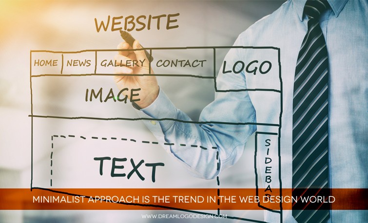
Minimalist Approach is the trend in the Web design world
Minimalism may sound very simple, but if we see in depth it is much more than just being “bare minimum.” Thinking minimalism is just so easy as it sounds might be a incorrect conception, as there are less elements with which you can provide the same features to the minimalist website for the convenient use of the visitors. To maintain a proper aesthetics with the same functionality, the web design becomes more meticulous. It can be said as combination of smart use of space, impressive visuals, impactful typography and most importantly the content has to be focused by all these.
It is one of the most effective ways to create an attractive yet simple website for a better user experience. There are 5 elements that make the approach minimalist in true sense and people appreciative for it. No points guessing that it has become a trend setter and popular style at present, you can also know required points below:
1. The concept of Negative Space
The foremost design element that maximum people relate with minimalism is space, to be precise, it is termed as the negative space and more of it. But we must know that it's not just a small design restricted with colorless scope. This approach also allows use of any color, though patterns are not advisable in this context. The most preferred backgrounds are the base colors, white and black, but for uniqueness some of the designers use colorful backgrounds in subtle ways. Negative space is effective in influencing the visitors visual flow, unhindered as the more negative space around the focused element draws the eye of the user to that element. Along with the above mentioned benefit negative space helps in better placing of the other required elements, restricting the design from overpowering the site visitor and are specifically better used for inner pages.
2. Big and Graphic Photography
It is not that every designer will have a same approach for this layout, some may feel that minimalist websites are way too distant emotionally, so bigger pictures can add a hint of familiarity without laying any effect on the foreground. The most spectacular art element in minimalist design is hero headers and images, that are defined by prominent slider created by the top scroll. Pictures used should justify all the minimalist features or else you get less benefits of the design. For example, choosing a wide picture of wall or empty place can be impressive, but a picture full of any items negates the advantages of minimalist interface.
3. Dramatic Type Interface
Like any other layout minimalist design also cannot do without words, they are vital elements. The typography selection should be apt and customized typography can be the point of focus here. it brings the attention of the user to the content that conveys the company message.
4. Lucidly Simple Navigation System
Minimalism requires hamburger icon. Simple design teamed with the aesthetically simplest navigation system can be the best for the users. The popularity of hamburger navigation is even compelling veterans of minimalism to change to hamburger navigation and icon for the best implementation of UI elements.
5. Striking Contrast
Use of the white background is mostly preferred by minimalist designers the cause, it is the most convenient canvas to play with color for setting a proper tone for the website. It is like the hallmark for the minimalist to select black or white background that creates a magical effect when combined with bold images.